

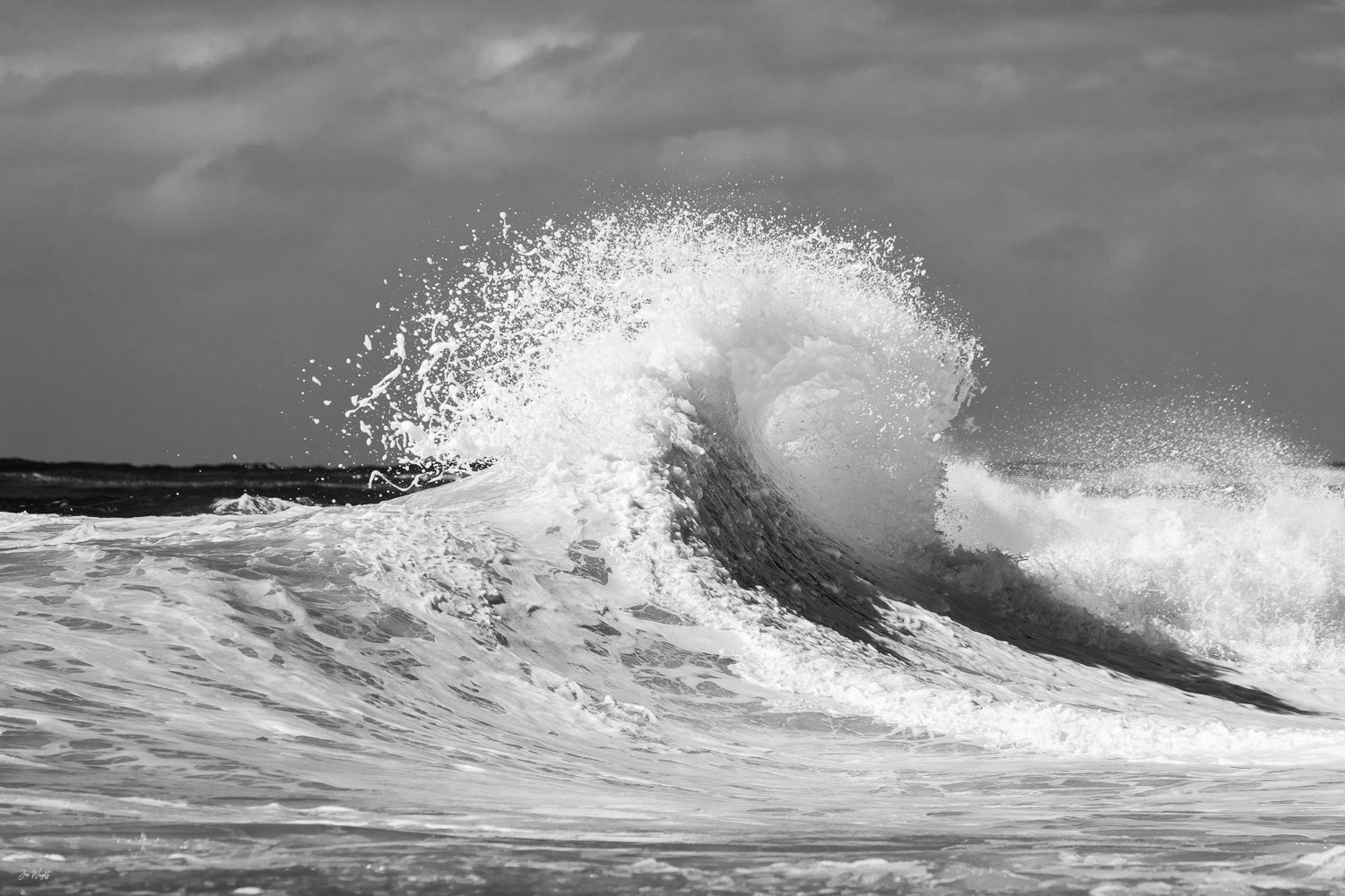
Most of what's written about buying ocean wave art online is written by people who've never stood in the water with a camera waiting for a set. I have, for years, off the Gold Coast, and the thing people get wrong when they're buying wave art online is thinking the wave's shape is what matters most. It isn't, not on its own. There are actually a few genuinely different ways I shoot a wave, and knowing which one you're looking at changes what you should expect from it and where it belongs in your home.
The different ways I shoot a wave
Ocean wave photography isn't one thing. A long exposure shot and a shorebreak shot are almost different disciplines, different risk, different gear, different moment. Here's how I actually break it down.
Long exposure and slow shutter
Time Warp is the clearest example of this one. I shot it with a slow shutter speed as the sun was setting, so the water softens into brushed, dreamlike motion and the wave itself glows warm gold. The technique trades a sharp, frozen moment for something calmer and more painterly, which is why it tends to suit a room you want to feel relaxed rather than energised.

Barrel and tube shots
Completely different discipline again. Eye Of Poseidon was shot in the barrel on the Gold Coast, looking through the wave's eye as it curls, light and water forming the shape that earned it the name. You're inside or right alongside the wave for this one, not standing back from it, and the reward is seeing something most people never get close enough to see, the wave from its own point of view.

Shorebreak
This is the one people underestimate. A shorebreak wave folds and closes out on sand, not along a point or a reef, so you're shooting right in the impact zone, close enough to get hit if you time it wrong. It's a completely different physical discipline to a barrel shot from open water or a lined-up wave from the air, there's no safe distance to retreat to, you're committed the moment you're in position. Kingscliff shorey is one of mine from just south of the Gold Coast, the wave folding gold and green over the sand, close enough to feel the spray. I'll be honest, this is a newer part of my catalogue and I've only got the one piece properly shot for it right now, more shorebreak work is coming.

Abstract and macro water texture
Not every wave photograph is trying to show you a recognisable wave. Detonate came from an early morning swim, before sunrise, shadows still lurking in the water, then the sun finally breaking through a wave about to explode just metres in front of me. Shots like this are less about the wave's shape and more about light, energy and texture, closer to abstract art than a seascape, and they suit a room where you want a bold, graphic statement rather than a literal ocean scene.
Colour or black and white, the same wave two ways
Whichever type above you're drawn to, you'll still have to decide on colour. The clearest way to see what colour actually changes is Wish Wash Colour next to Wish Wash B&W, the same wave, colliding with another off the rocks at Snapper Rocks, same crop, same moment. In colour it's vibrant blue and white, energetic, suits a bright coastal room. Strip the colour out and it goes graphic and moody, more contrast, more shadow, suits a modern, monochrome space. Neither is the right version, it depends entirely on the room.
Which way it's breaking, and how the room reads
Something people don't think about: which direction the wave is breaking, left to right or right to left, and how that sits with the room. I think about which way you naturally look when you walk into a space, or which side the room opens up toward, and try to hang the wave breaking into that open space rather than off toward a wall or a doorway. It's the same logic as hanging a portrait so the subject faces into the room instead of out of it. Offshore Blue, with its soft pastel water, is a good one to think about this with, it's a calmer piece, so getting the direction right matters even more since there's nothing dramatic to distract from it if it feels off.

Sizing and orientation
Most wave shots read best horizontal, since the motion runs left to right rather than up and down. For above a sofa or bed, the usual two thirds of the furniture width rule applies. For a dramatic storm wave like Chaotic Allure, going larger actually helps, scale adds to the sense of power rather than overwhelming the room.

Framed, canvas or acrylic
Same logic I use everywhere else: acrylic gives the most depth and detail but is reflective, so it needs a wall without direct glare. Canvas suits brighter rooms since it absorbs more light. Framed is the traditional pick, and pairs with non-reflective glass if glare's a concern. I've gone through this in more detail in my Framed, Canvas or Acrylic guide if you want the full breakdown.
Where to start
The full range is in my Waves collection, everything from clean peeling walls to heavy barrels to the quiet moment before a set.


