

I already wrote the practical version of this, Framed, Canvas or Acrylic?, and the short version is it comes down to the room's light more than the image itself. This is the piece I've been meaning to write since, less about the mechanics of each finish and more about how I'd actually style an ocean or wave photograph into a real coastal home, room by room, palette by palette. Think of it as the interior stylist's follow-up to the practical guide.
I've pulled four real rooms below, not product shots on a plain wall, actual styled spaces, so you can see how the colour in the water changes what frame and finish makes sense.
Bright coastal, white and oak

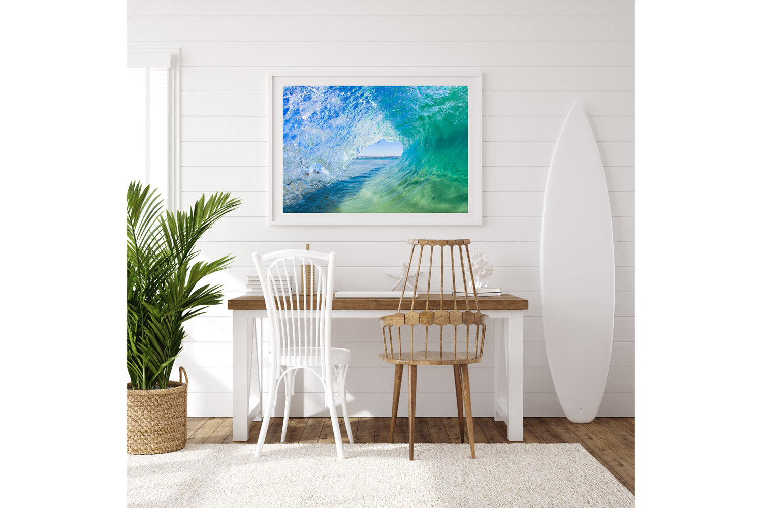
Inside The Green Room is a barrel shot from Snapper Rocks, cool blues and greens with light coming straight through the wave. Styled here in white against a shiplap wall with a surfboard and a palm, it's the classic bright coastal look, and it's exactly the kind of room where I steer people away from acrylic. A room that's already full of natural light bouncing off pale walls and timber doesn't need more reflection fighting the photo for attention. Canvas, or a framed piece with non-reflective glass, lets the actual blues and greens in the water do the work instead of the glass.
Light and breezy, for open plan coastal living

Greenmount Summer looks through pandanus branches to the beach itself, sunbathers under umbrellas, surfers in turquoise water, Surfers Paradise a silhouette on the horizon. It's a much softer, paler palette than a punchy wave close-up, so I'd frame this one rather than push it to acrylic or canvas, a simple white or raw oak frame keeps the whole thing feeling airy and lets the pastel turquoise stay the hero, which is exactly what an open plan living or dining space wants, something that reads as calm from across the room, not a piece competing for attention.
Texture and depth, for an abstract statement wall

Depth & Perception is the showpiece of my White Wash collection, a close, abstract look at foam and froth at the moment it breaks, soft pastel blues and purples rather than a recognisable wave or beach. This is where acrylic genuinely earns its name, depth and perception are quite literally what it's about, and the extra layer of glass gives a piece like this real dimension, the kind of thing you notice more the longer you look at it. It's the one I'd choose for a room that wants a proper abstract statement rather than a straightforward beach scene.
Quiet minimalism, for a hallway or entrance

Zephyrus is a turquoise barrel exploding into white spray under stormy grey cloud, styled here as a gallery wrapped canvas above a console table in a hallway. A hallway or entrance is a high traffic transitional space, people brushing past with bags and kids, so canvas makes practical sense there in a way it might not in a formal living room, no glass to catch a knock, and the wrapped edge gives it presence without needing a frame at all.
The pattern across all four is the same one from the original guide, just applied with a stylist's eye rather than a technical one. A bright, sunlit room usually wants canvas or a simple frame so the room's own light doesn't fight the glass. A softer, pastel piece in an open living space wants a quiet frame that lets the colour stay calm rather than a finish that adds shine. An abstract, textural piece is where acrylic's actual selling point, depth and perception, genuinely pays off. And a busy transitional space is where canvas earns its keep regardless of palette. If you want the full mechanics of each finish, that's all in the original guide.
All four pieces above, and plenty more like them, are in the Ocean Art, Surf Art, Life's A Beach and White Wash collections, every one available as framed, canvas or acrylic.


